Time has been flying past and the preparations for Nothing Ever Happens Here to be released as a paperback has been my major project. Now, at last, we come to the final design for the cover. The original photograph used is still going to be the same. It was taken in the area that the book is set and says (to me) ‘a holiday on the coast … but with dark foreshadowing’. So the changes are mainly to do with the lettering. My own name will be as it is on the Paperback version of The Angel Bug…. so we are left with the words ‘Nothing Ever Happens Here’.
Here is the problem. Fonts speak. Just the mere shape, density, texture of a font can create a different feel, a different sense in the mind of the reader.
Here are the current three front runners to occupy the space on the front of the paperback. Please help me choose. (You can click on each picture to enlarge in a separate window)
To help you choose, if you haven’t read the novel already, here is the blurb ….
Crime, romance, smuggling and Cornwall all come together in this light thriller set in the early 1990s
Living in London suddenly becomes too uncomfortable for the attractive Jo Smart and her sixteen year-old son, Alex, after he is beaten up, so when they are offered the chance to take an immediate holiday in a peaceful Cornish town they jump at it. But not all is as peaceful as it seems as they become involved in a murder inquiry, drug raid and abduction.
DI Rick Whittington has also escaped from London and the reminders of the death of his wife and child, and through his investigations finds himself meeting Jo and being drawn into the events surrounding her.
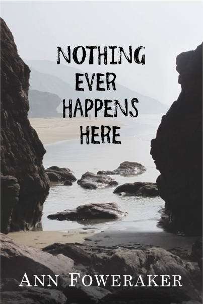

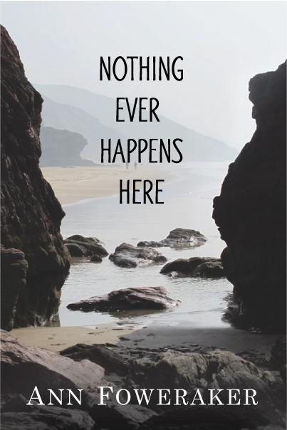
So which font fits best, 1, 2, or 3?
Which ‘says’ the right thing to you?
How and why did you make your choice … which may just be a gut feeling?
Do help me out here, you know I love to hear from you … I need to hear from you … Thank YOU!